
We have many posts on this website (and even two courses) on how to set up Google Analytics. Beyond our website, there are millions of resources on the internet on how to set up any analytics tool. But even if you follow all these steps, and do everything by the book, your analytics data is still wrong. Why?
Unfortunately, no analytics tool is perfect. And in fact, analytics will never be perfect. There may have been one point many years ago where you could properly track everyone using your website via an analytics product, but we’re well past that point now.
There are several reasons why your analytics data is wrong:
- Ad blockers stopping analytics from recording
- Visitors refusing analytics tracking via a cookie consent dialog
- Browsers with privacy features that regularly clear analytics cookies
- Visitors using multiple devices or otherwise messing around with our analytics tracking
How do ad blockers make your analytics inaccurate?
Most ad blockers are built to recognize and stop analytics code from running, which means that those people won’t show up in your analytics program. This isn’t just a Google Analytics problem; this will happen to anyone who is using a JavaScript-based tracking product — which is most of the analytics products out there.
If a visitor is using an ad blocking extension in their browser, they won’t show up in your analytics at all. The only way you’d know that they existed would be if they voluntarily left their information in some way, such as by filling out a form or buying something. When that happens, you still won’t see that visitor in your analytics but you’ll have the form fill or purchase as evidence that they were indeed on your website.
Are ad blockers really that popular?
Yes, according to a 2024 Censuswide survey—52% of Americans use an ad blocker. That number goes up to 66% for “experienced advertisers.” It’s pretty ironic that we want to track others but refuse tracking for ourselves, right?
Can server-side tracking help get around ad blockers?
You may have been told that changing your analytics configuration over to something called “server-side tracking” will help you avoid ad blockers. Server-side tracking is a way of deploying analytics that doesn’t depend on running JavaScript in the visitor’s browser (called “client-side tracking”), which means that ad blockers may not be able to see what they need to block, and you can still track that visitor, even if they have an ad blocker installed.
It may work a bit for now, but it’s only a matter of time before ad blocking products have a new solution that’ll reliably block server-side tracking as well. Server-side tracking also isn’t as easy to implement as client-side tracking and it’s unlikely that smaller businesses will be able or willing to implement it just to get a bit more data from their website visitors.
Server-side tracking can help your tracking avoid ad blockers (at least for now) but it won’t solve all our analytics accuracy issues.
How do cookie consent products make your analytics inaccurate?
Simply put, if a visitor doesn’t want to be tracked, you can’t track them with traditional analytics methods. Depending on the privacy rules in the jurisdictions that you serve, you could end up losing as much as 80% to 90% of your GA4 data via visitors refusing cookies. If you have consent mode set up properly on your website and you have enough visitors saying yes and no to cookies, GA4’s modeling can help to fill in the gaps—but some privacy experts believe that even this so-called “cookieless” tracking shouldn’t be allowed under privacy rules such as GDPR.
Some alternate analytics solutions, such as Matomo, also have cookieless options, but even if you use that, it isn’t a magical solution either—cookies still can’t be used for tracking which means that you can’t track individual users over time. Instead, you’re limited to tracking visitors in their current session and are unable to do any multi-touch analysis.
How do browsers with privacy features (such as Safari) make your analytics inaccurate?
Safari has a technology called Intelligent Tracking Prevention (ITP) which limits the lifespan of first-party cookies to 7 days at maximum. GA4 uses a first-party cookie, which means that if a visitor is using Safari to view your website, they will have their cookies cleared every 7 days and thus will look like a new user when they come back to your website, even if they’ve visited your website 1 or 100 times before.
This doesn’t just affect Google Analytics, it impacts any tracking cookies that are set for multi-touch attribution purposes. For example, if a visitor comes to your website via LinkedIn Ads, and then takes longer than 7 days to go ahead with getting in touch with you, that form fill won’t be attributed to LinkedIn Ads since the first-party cookies that were originally set are now cleared.
Prove your value to clients with advanced reporting skills
How can website visitors cause issues with our analytics tracking?
Think of how you use the internet. Do you only use one device, and make sure that you’re following nice neat attribution paths, and making sure you convert right away after clicking on an ad? Of course not. So why do we expect that of our website visitors?
Here is a recent personal example for you. I live in an area where you have to spray for ants every year. Our usual pest control person has retired so we needed to find a new company. I did lots of Google searches, found a good option, and texted the link to my wife. She contacted them to book the appointment as I wasn’t going to be home when they were going to visit. How would this sale be attributed? Since I sent the link to my wife via a text message, it would be attributed to Direct, assuming that this pest control company was using call tracking on their website. Yes, I found them via organic search, but I didn’t actually get in touch with them—so they might see the initial website visit via organic but not the conversion.
That’s a classic example of so-called “dark funnel” traffic, where you see someone engaging with your sales funnel but you have no idea how they got there in the first place.
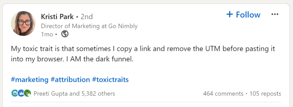
Even using UTMs won’t save us, since people like Kristi (and probably you!) end up removing them.
How can we work with inaccurate analytics data?
As marketers, we still need to do our jobs and that involves looking at analytics and making decisions and recommendations—even if the analytics are ultimately inaccurate. In the past, we may not have done a good job of communicating the inaccuracies in analytics (or maybe we were unaware of them!) and so the people we report to and work with tend to expect or demand precision in our reporting—a precision that just isn’t possible.
What if your boss or client demands precise analytics data?
We hear from marketers all the time about demanding bosses or clients who expect perfection in analytics and won’t accept anything less. We typically approach these (tough!) conversations with the facts—like what we’ve covered in this post so far. There are many reasons why analytics isn’t accurate and instead of trying to chase an analytics perfection that just isn’t possible, we would be better off working with the data that we can capture and making decisions based on that.
When I personally speak to clients about imperfect data, I go through the examples I’ve just covered in this post—ad blockers, cookie consent, and the not-useful-for-attribution ways that people will engage with your brand and your website online. Be confident when explaining that the data is imperfect. This is a reality of modern marketing and isn’t something to hide.
Of course, others may tell that boss or client that you’re wrong, they can make analytics be perfect, it just takes this one server-side tracking tool, or this new analytics product, or this one configuration change. But that just isn’t true.
Ultimately, it’s up to you and your team to decide—you can accept that we aren’t data accountants and work with the data that we do have, you could chase an impossible analytics perfection, or you could just pretend that analytics is absolutely perfect and deliver pleasant lies to your boss or client. The choice is yours.
If you choose to accept that we aren’t data accountants, that means that we need to change how we report on results and make decisions based on the data that we do have.
How to make marketing decisions with inaccurate analytics data
Using directional indicators in our reporting will enable us to still deliver reports and recommendations, without getting bogged down into inaccurate absolutes. Directional reporting tells us what the trends are. You’re probably already using directional questions in your reporting, such as:
- Which landing page is doing a better job of driving sign ups?
- Is our organic search traffic increasing or decreasing?
- Is this video encouraging people to buy our products?
Let’s answer these questions with a directional approach.
How to report on which landing page is doing a better job of driving sign ups
Right now if you were asked this question, you’d likely put together a nice table with a list of landing pages and then sessions and conversion/key event metrics, like so:
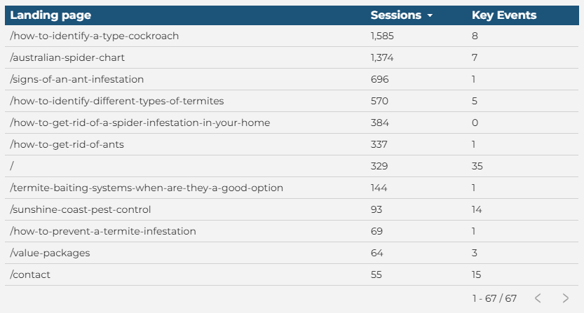
This table isn’t very easy to parse—after spending one second looking at it, can you tell me which pages are successful? We can see that the home page (/) has the most key events but how does that relate to the number of sessions that page has?
Instead, let’s remove these numbers and report on the sessions and key events as a percentage of the total:
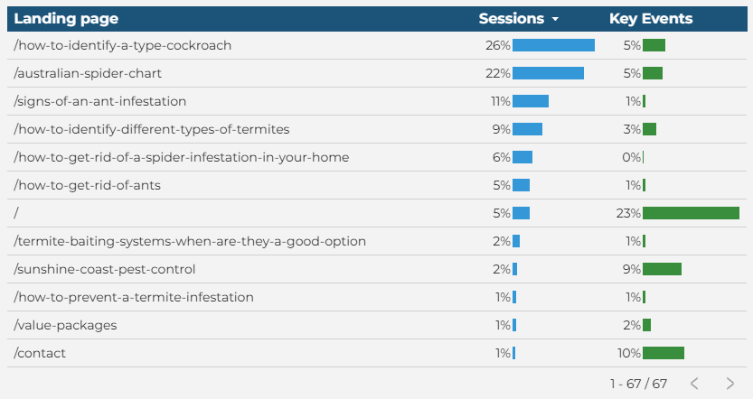
This is exactly the same data as we saw in the previous screenshot, but now we’re only evaluating how much that particular page contributed to the website’s overall session and key event count. By using these bars in our reporting, it’s very clear which pages are doing a great job of driving sign ups on our website.
If you want to try this out for yourself, in Looker Studio, here’s a quick video on how to do this.
How to report on whether or not organic traffic is increasing or decreasing
In the past, we’ve used what we call a rolling dashboard to report on how various traffic sources (including organic) are performing over time. For example:
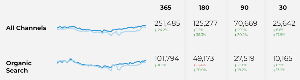
This report shows the weekly trends for the past year, compared to the previous year, and then for each individual time period it’s compared to the previous period and the previous year (e.g. last 180 days compared to the previous 180 days, and then compared to the same 180 days last year).
It’s a really useful report, but it over focuses on the actual numbers, which may or may not be accurate.
Let’s change this report up:
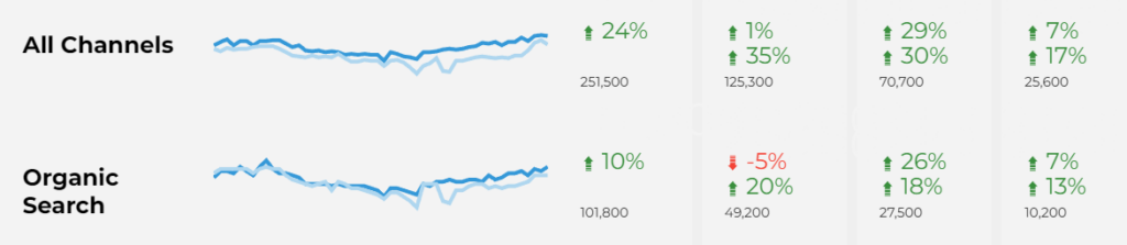
Now we’ve made the percentage change values the focus, and removed the decimal point on the percentage change—is 24.2% vs 24% meaningful when you’re looking at an entire year of data? It probably isn’t, so let’s simplify these numbers as much as possible. We’ve still included the actual numbers but now they’re rounded to the nearest hundred to again remove the illusion of accuracy. We have a tutorial on how to round large numbers in Looker Studio as it isn’t possible without a custom field.
Become confident and capable using Google Analytics
How to report on whether or not on-site videos are encouraging people to buy your products
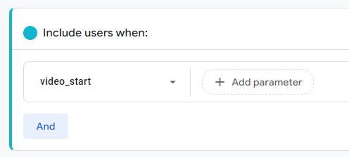
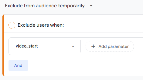
Creating videos is an investment and you want to be sure that the investment you’re making into this type of content is paying off. First, we need to create audiences (or segments) in GA4 of people who watched some of any video and of visitors who did not watch any video at all.
This is our “positive” audience—the visitors who watched any part of a video:
And this is our “negative” audience—visitors who haven’t watched any videos at all:
Once you’ve gathered data, you might report on this information in a table just like this:
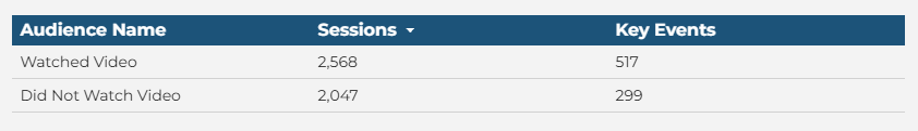
Similarly to our landing page example earlier, numbers aren’t necessarily the easiest way for people to see what is actually better. Let’s change this up to a percentage of the total instead:
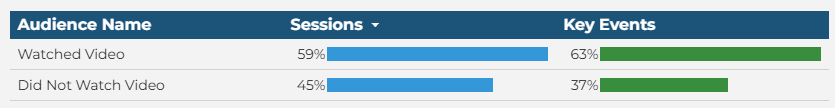
Now it’s quite clear that videos are indeed helping drive up sales!
How effective is your marketing?
In addition to these directional examples we’ve provided you, one other metric that we recommend you introduce to your reporting is what we call “Effectiveness.” Effectiveness is a comparison of two metrics—for example, how many people saw your marketing at all anywhere, and how many purchases happened. Skip all the other funnel parts, and just focus on these two metrics, and that’s your Effectiveness.
You can pick any two metrics you want for your Effectiveness calculation. Let’s go through some examples.
How to measure impression to conversion Effectiveness
First, to measure impressions, we’re going to look at impressions across all the different places a company’s marketing or brand generally could have been viewed—organic search impressions, ads impressions, social reach, billboard reach, and so on.
To measure conversions, we’ll look at not just online sales but offline sales as well, by adding up the total number of transactions that company had in the time period we’re evaluating.
Then, Effectiveness is simply the Transactions divided by the Impressions. This is a chart you can end up with when you use these metrics:
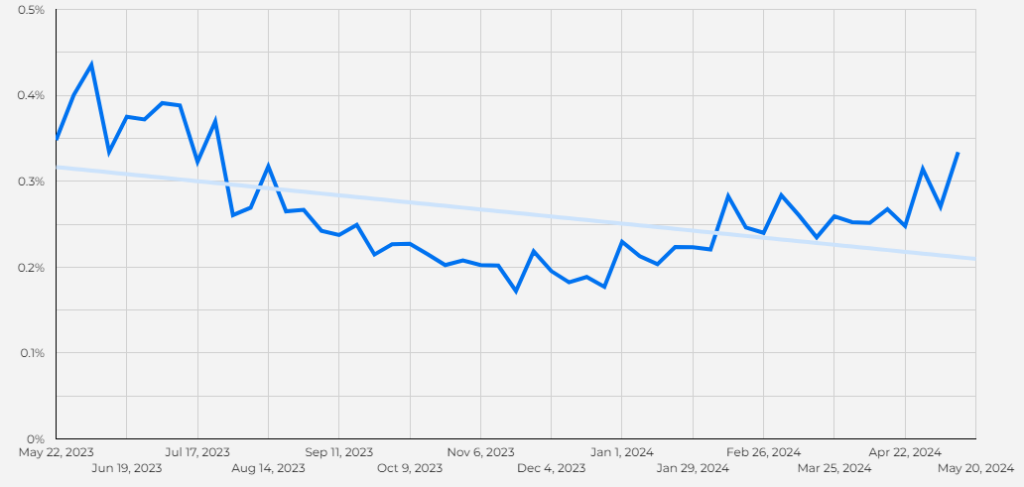
Adding a trendline like you see above helps you see how the Effectiveness is trending over time. We can see for this particular business that they had a slow winter (typical for them) but they aren’t bouncing back quite as quickly as they usually do in the spring. If we are only looking at the impression and conversion numbers, they would both appear to be up—a net positive. But once we introduce Effectiveness, we can see that this company should be doing better than it is and it gives us a starting point for investigation.
How to measure Effectiveness of different devices on your website
Another easy Effectiveness measure is looking at the number of sessions broken down by device and compare it to the number of conversions/key events by device, like so:
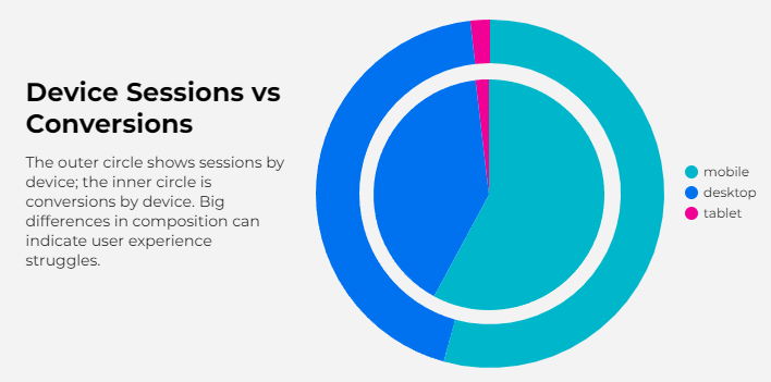
This is two overlaid pie charts in Looker Studio. The outer donut chart is sessions by device, and the inner pie is key events by device. It’s easy to see if the size of the “slices” don’t match up—if they aren’t even close, then you know that people on that device are struggling to convert. Since you’re only working with people who allowed tracking, you don’t need to worry about inaccurate numbers, and in fact, this chart shows zero numbers at all because you don’t need them.
How to measure email marketing Effectiveness
If you invest in email marketing, you know that it’s getting more difficult to know if your emails were opened, clicked, or even delivered. Plus, not everyone will necessarily use your email when they convert on your website—they might visit it directly, or even come into a store if you have physical locations. Your emails would still be having an impact if it spurs someone to visit in person and make a purchase, but since it isn’t attributed, you wouldn’t see that in a typical marketing report.
Instead, evaluate the number of emails that you send against the number of transactions (or store visits, or form fills, or whatever makes sense for you). If you send more emails, do you have more transactions? It’s a simple yes or no question that doesn’t rely on perfect attribution to answer.
How to measure the impact of technical SEO improvements
Technical SEO improvements can be difficult to get implemented, so if they are, you want to be sure that you’re measuring them as best you can. How do you do that? By evaluating the number of fixes that were implemented and comparing it against your organic search traffic over time. Does traffic go up as more fixes are implemented? This kind of input to output focused report again removes the need for perfect attribution—you know the work that you did, and you can see how many people (approximately) came to your website via organic search results. If that trends with the implementation of your technical SEO fixes, then you know you’re having an impact.
How to measure the impact of new content on customer churn
You’ve decided to publish a number of new posts that are focused on educating your customers on how your product works, with a bit of sales added in, of course. What you aren’t sure of is if these posts are reducing customer churn since it could be months between you publishing a post and a customer actually needing to use it to help them use your product. In this case, compare the number of posts that you publish with the customer churn rate over time. Since tracking is imperfect, you may not be able to say “these customers definitely saw these posts” but you can certainly say that you published these posts—you had this input—that resulted in less churn—the output.
Strengthen client relationships and champion transparency with advanced analytics skills
Changing up how you report is tough
Marketers have been pretending to be data accountants for years, and it’s a tough habit to break. The transition from Universal Analytics to GA4 showed people how easy it is to have two different outcomes in analytics with exactly the same inputs, since different analytics products measure metrics in slightly different (or sometimes radically different) ways. In that case, which tool is right? They’re all right, in their own way—which means that it’s time to let go of this false sense of truth in your data and instead focus on directionality and Effectiveness.
The time to start on this process is right now. Measurement isn’t going to improve—in fact, with more and more privacy legislation being implemented all the time, our ability to measure is only going to get worse. Implementing these changes now in your reporting means that you won’t be caught unawares when your data starts to go away even more than it already has.

Dana enjoys solving problems that haven’t been solved before. With her 20+ years experience in digital marketing and teaching, she has a knack for distilling complex topics into engaging and easy to understand instruction. You’ll find Dana sharing her knowledge at digital marketing conferences around the world, teaching courses, and hosting a technology column.
Learn more about Dana