Comparing values in Looker Studio against a previous period, previous year, or even another time period entirely is very simple. Open the Chart Setup options, and then select your time range in the Comparison Date Range field.
When you add a comparison date range to your table in Looker Studio, a new column is added with a title of “% Δ” (percentage delta) to indicate that this column contains the percentage change values for the two time periods that you’re comparing.
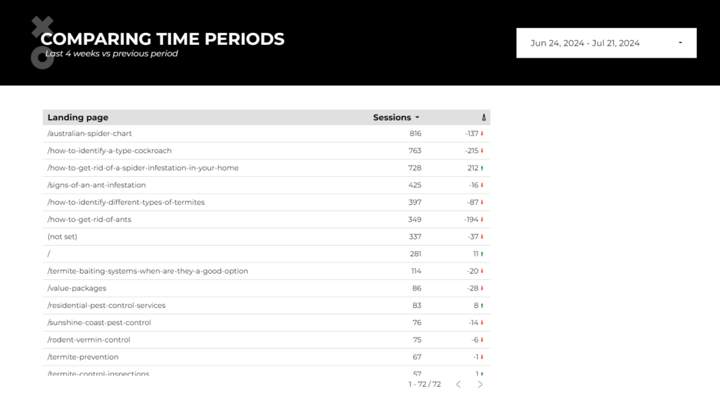
Unfortunately, you can’t actually sort by this percentage delta column to see which metrics changed the most- you can only visually scan the column and look for the big changes yourself.
How can you create a table in Looker Studio where you can sort by the changes in the comparison values? Let’s walk through that process now.
In this walkthrough we’ll be working with GA4 data, but this process will work with any data source at all in Looker Studio, such as Google Search Console, Google Ads, or even a Google Sheets data source.
Video tutorial: How to create sortable table for different time periods
Step 1: Blend your data source with itself
Our first step is to blend the data source that you’re using with itself. The easiest way to create a blend in Looker Studio is to create two tables with the values you want. In our example, we’re looking at GA4 data with a dimension of landing page and a metric of sessions, and here are our two tables, with exactly the same data and the same data source.
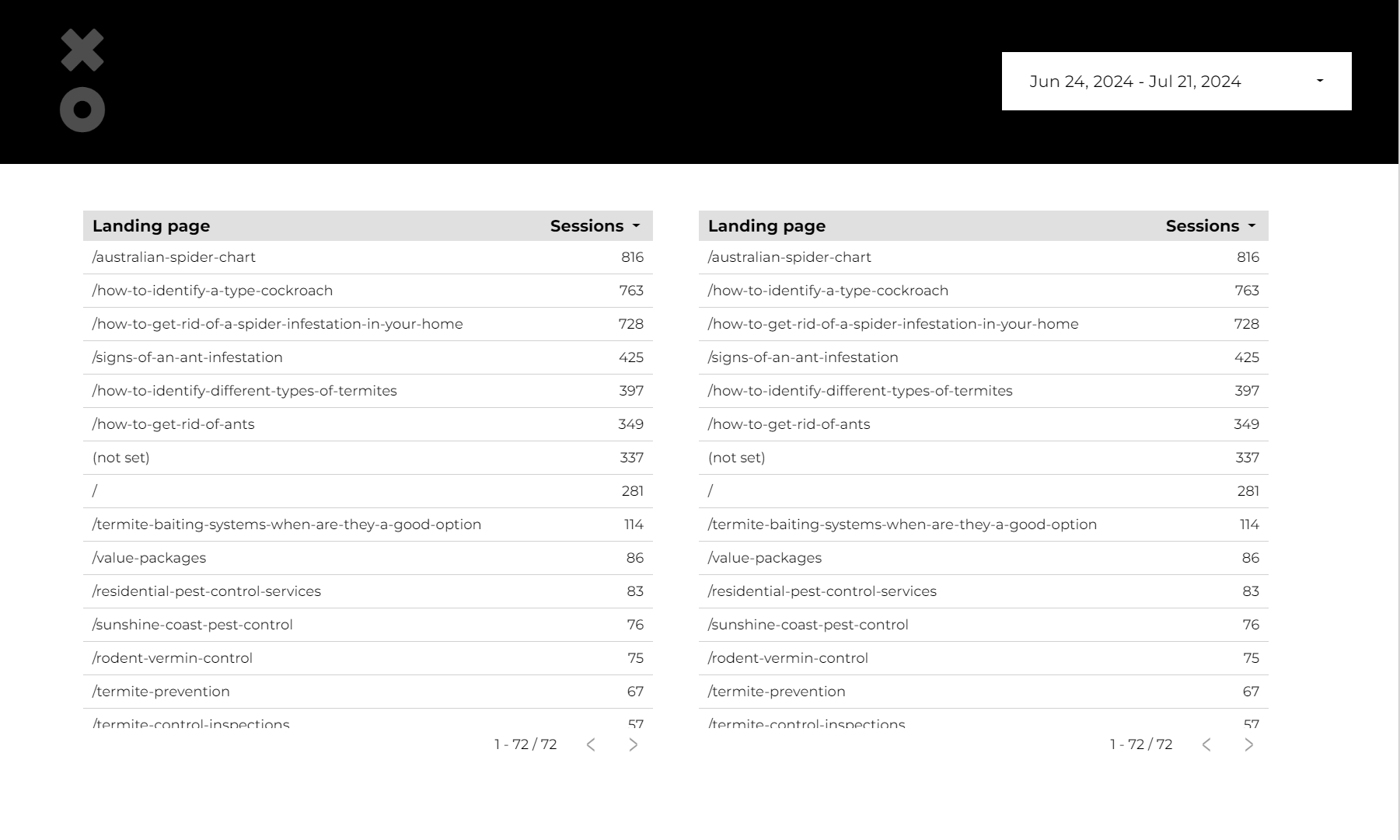
Select both tables, then right-click and choose “Blend Data” from the menu. You’ll end up with a table that might look like this.
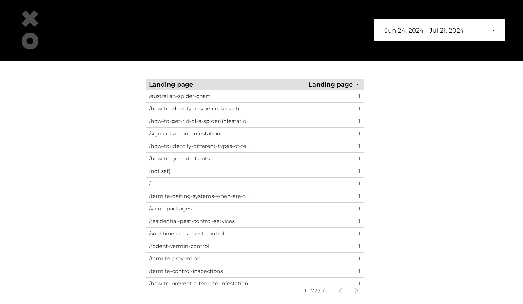
Don’t worry about the odd values for now, we’ll fix that in a moment.
Looking to advance your reporting skills?
Step 2: Modify the join of your blended data source
With our new table selected, mouse over the name of the data source in the chart properties, and you’ll see a little pencil icon show up:

Click that, and the Blend Data window is shown.
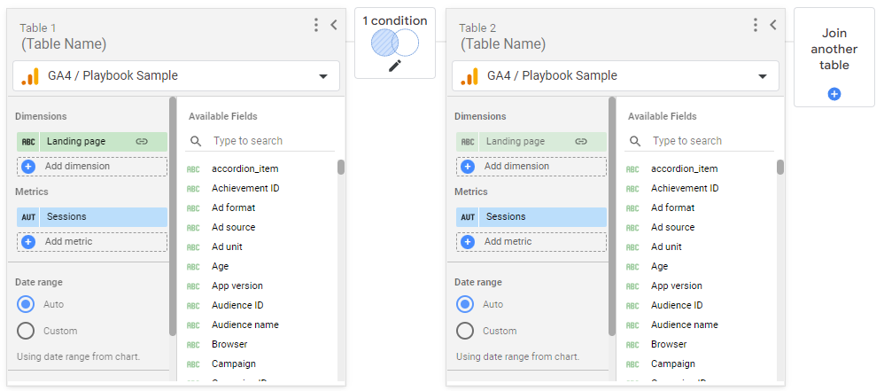
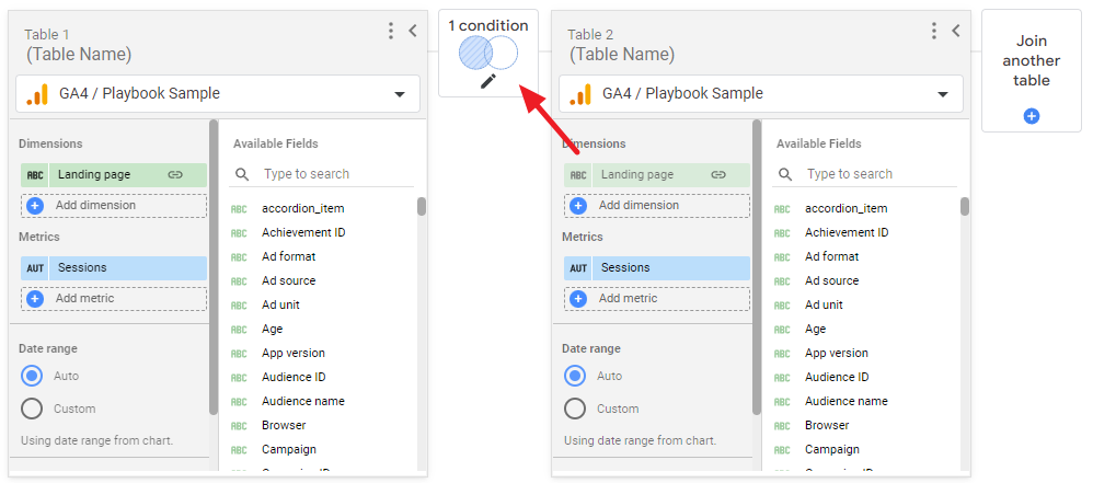
Click on the box where it says “1 condition”:
The Join Configuration dialog will open. Select “Full Outer” and make sure that the Join Conditions list Landing Page with a link between them. Your Join Configuration dialog should look like this when you’re done:
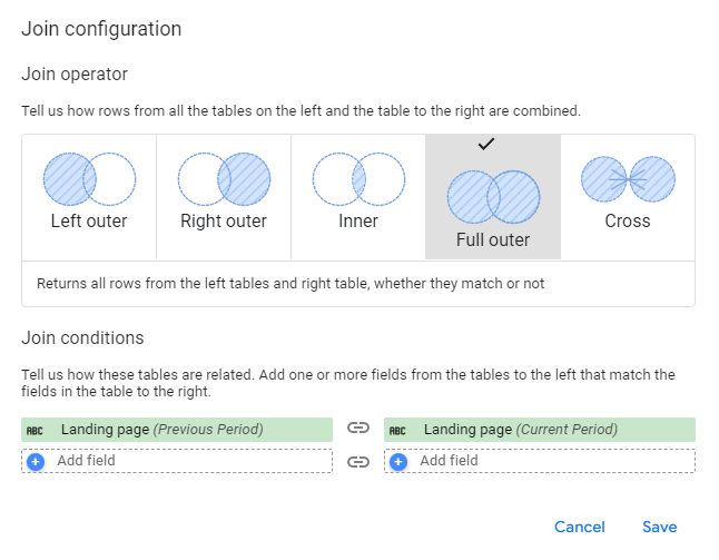
Click “Save” to return to the Blend Data window.
Step 3: Rename the tables and metrics in your blended data source
Next, rename your tables and your metrics so that you are clear on what table is bringing in which metrics. The items you’ll rename are indicated with the red arrows:
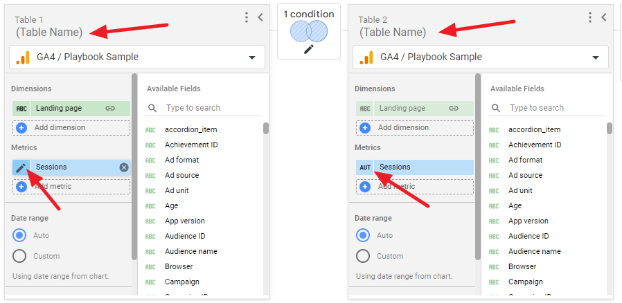
In this example, we’ll make the table on the left be for the previous period, and the table on the right to be for the current period. You can name the tables and metrics whatever you want, just make sure to be clear! This is how we’ve named ours:

💡 Important Note: The order of the tables doesn’t actually matter. We could have put the Current Period on the left and the Previous Period on the right—the order is up to you.
Step 4: Set the time periods in your blended data source
Now that our data sources are renamed, we can set the time periods for each.
The table on the left is for our previous period—for this example, let’s compare the last 4 weeks to the 4 weeks before that. We’ll use the Advanced data options in Looker Studio to accomplish this.
On the left table, select the Date Range of “Custom” and then click on the date selector to open it up. The very last option in the drop down is named “Advanced”, select that.
The advanced date range selector gives you many more options for date ranges—in our case, we’ll set the Start Date to be today minus 8 weeks (starts Monday), and then the End Date will be today minus 5 weeks (starts Monday). This is what that would look like:
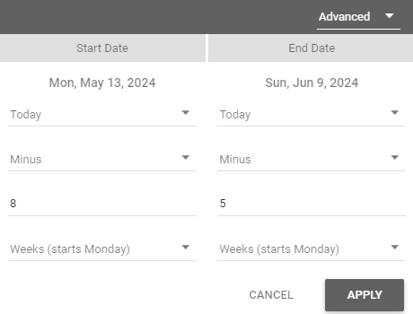
Click “Apply”, and then on the current period table, select a Date Range of “Custom”, click on the date selector, and now we’ll set our range to have a Start Date of today minus 4 weeks (starts Monday) and an End Date of today minus 1 weeks (starts Monday).
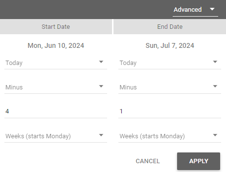
Click “Apply”, and now we have our date ranges set.
Click “Save” at the bottom right to save your Blend Data settings.
Want to learn how to make reports that client's will actually read?
Step 5: Add the change metrics to the table
Finally we can add in our change metrics!
- First we’ll add in the change amount. Click “Add Metric”, then click “Add Field”, and enter this in the Formula box: Current Sessions-Previous Sessions
- Name the field (for example, “Change”) and click “Apply”.
- Next, let’s add in a percentage change metric. Click “Add Metric”, then “Add Field”, and enter this in the Formula box: (Current Sessions-Previous Sessions)/Previous Sessions
- Name the field (for example, “% Change”) and click “Apply”.
Step 6: Correct null values in your table (optional)
If you have any landing pages that only had sessions in one of the time periods, you may end up with metrics that say “null” in your table. If so, your change and percent change metrics will also show up as “null”. If you have this happen, you’ll want to change up your fields so that they are showing you a useful number, not just null.
The IFNULL function in Looker Studio is what you want to use here, like so:
IFNULL(Previous Sessions,0)
What this function does is turns any null value into 0—or whatever number you want it to be.
You might not want to always use 0 in the IFNULL function, particularly if there is a chance that you’ll end up dividing by 0 as a result.
For example, if our Previous Sessions are null (changed to 0) and our Current Sessions are 80, this is what our percentage change formula would look like: (80-0)/0
We can’t divide by 0, so what can we do? We can use the NARY_MAX function to set the value of the Previous Sessions metric to be equal to the Current Sessions metric, thus resulting in a percentage change of 100%.
Here is what that formula would look like:
SUM(IFNULL(Current Sessions,0)- IFNULL(Previous Sessions,0))/SUM(NARY_MAX(Previous Sessions,Current Sessions))
The NARY_MAX function will return our requested metric if our original metric is null. In this case, Previous Sessions is null, so the value for Current Sessions is returned instead. If the Previous Session value isn’t null, we’ll have the value for the Previous Session returned.
Since Previous Sessions is null, our percentage change formula now looks like this:
(80-0)/80
This results in a percentage change of 100%, which more accurately represents the change in the sessions between our two time periods.
You’ll also notice that there is a SUM function added in—that’s necessary when working with blended data sources, and it must come before the IFNULL function.
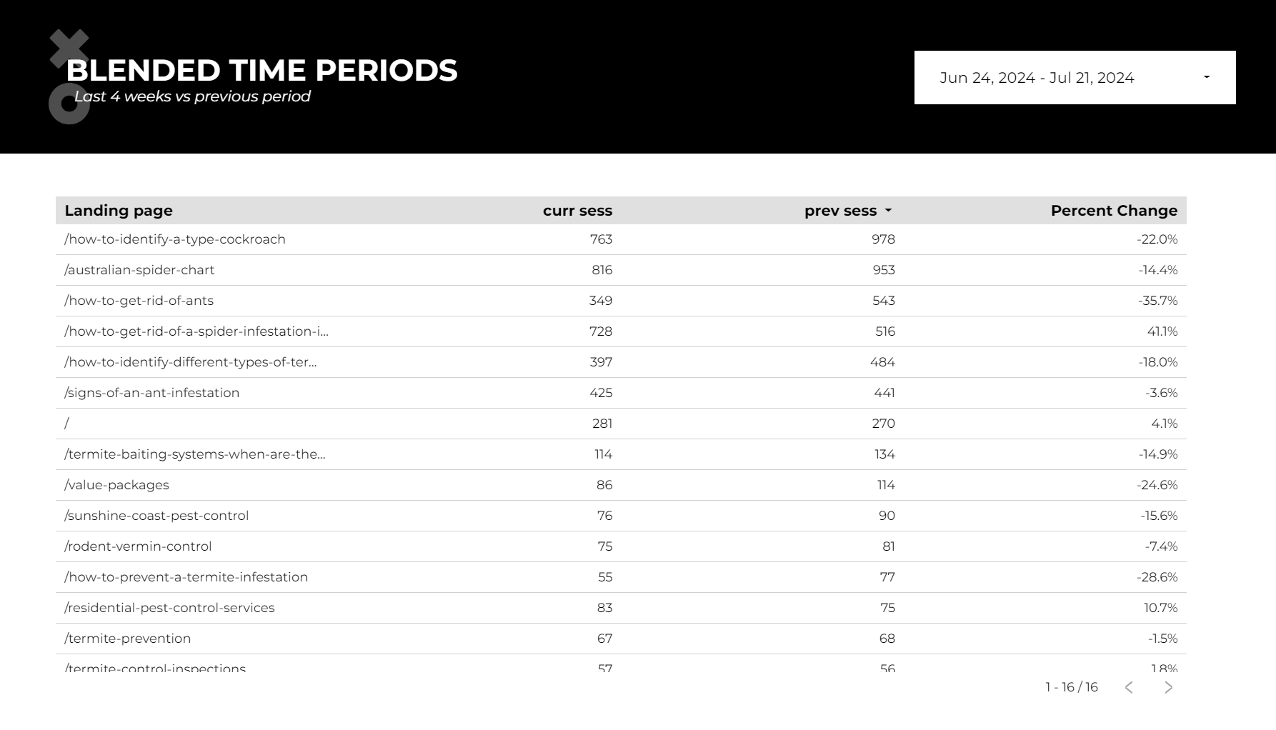
Step 7: Style and filter your table
Now that we have our data, let’s make it look good. Typically we’ll use heatmaps so that it’s easy to visually identify the changes.
To add a heatmap, click on the Style column, and select Heatmap for the metrics that you want to have stand out visually. We typically add heatmaps to any change or percentage change metrics.
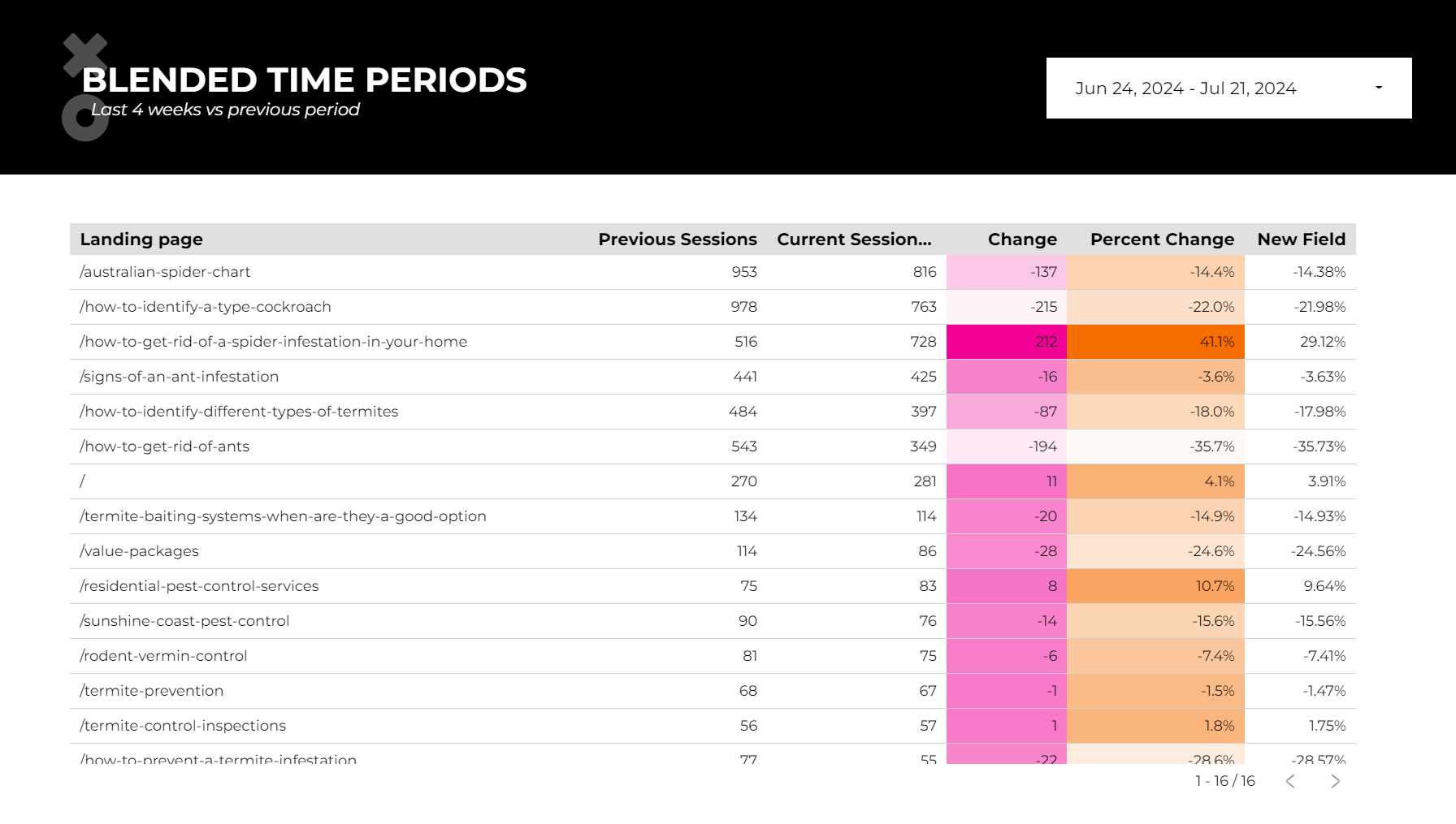
We also recommend removing any decimal points on the percent change field, because realistically will you make a different decision between a percentage change of 12.1% vs 12%? If not, remove that decimal. We cover this in more detail in our post on how to deal with inaccurate marketing data. You may also want to round your metric numbers—if so, we have a post outlining how to round large numbers in Looker Studio.
Finally, we’ll add a filter to tidy up our data. You may have noticed that you have a Landing Page of (not set), that happens when people leave tabs open for a very long time. We can filter this out or leave it in, that’s up to you. If you want to filter it out, click on the “Setup column”, then scroll to the bottom and click “Add a Filter”, then click “Create a Filter”. Here is what your filter will look like:

Now you have a table with a change or percentage change metric that is sortable. If you run into issues or have more questions, please leave a comment on our YouTube video!
