How I Use Claude to Build Dashboards Faster
The slowest part of building a dashboard has never been building the dashboard. It’s the twenty minutes I spend staring at an empty page working out what the thing is supposed to answer, then the twenty after that changing my mind, then the hour after that rebuilding what I’ve already half-decided.
Enter AI! That should make it faster, right? The catch is that when people talk about using an AI tool (such as Claude) for data analysis, they focus on the prompt, but what actually determines whether the output is any good is the context you’ve given it beforehand. That includes information like what this client cares about, what you’ve already decided together, and what you believe belongs on a dashboard in the first place. The prompt is the easy part, but the context gives the dashboard a direction and a point of view.
I walked Myles at BrightLocal through this on a screen share, and you can watch the skill actually running there. This is also an instruction set that I provide as a part of my Analytics for Agencies course!
Watch the video
Let’s walk through what goes in, what comes back, and the parts you still have to do yourself.
Don't start with a blank page
When I’m building a dashboard, the sequence in my head goes something like: what question am I answering, so what data do I need, so what chart shows that, so where does it go on the page. That sequence is the slow bit. None of that involves touching Data Studio (formerly Looker Studio), it’s all decisions.
I used to sketch this part out by hand in my notebook, but I’m still redoing it from scratch for every client. Instead, I’ve now built a Claude project that already knows how I think about reports. I feed it context about a client, or a call transcript (with permission), and it hands back a document laying out what the dashboard should do and how it should be structured. At this point we don’t have a finished dashboard (I can’t work miracles) but the initial planning part is done.
On a dashboard I’m building from nothing, this saves me a few hours, and for me it’s far easier to make edits to something than to start with nothing. Of course that’s my experience on my dashboards, and your mileage will vary depending on how much you’ve already got written down.
It also works in reverse! I can point the same project at a dashboard that already exists and ask what would make it better, which is useful when you’ve inherited someone else’s reporting and know it isn’t great but can’t quite articulate why.
What goes into the project: the context layer
There are four parts to this instruction set, each with an important job:
- Everything I’ve said (recently) about dashboards. Talk transcripts, blog posts, training course materials. They’ve all been fed into a retrieval database so the project can pull my own past reasoning rather than whatever the model thinks a dashboard should look like on that day.
- Call transcripts. This is what the project was primarily built to take. When we’re on a Zoom call with a client talking about their reporting, that transcript goes straight in. Make sure your client is okay with call recording before you do this, though! What I like about using transcripts is that you get the client’s own words, how they naturally describe things, instead of a stuffy sounding brief.
- Client records. We keep the major decisions we’ve made with each client in Notion. That includes who is this client, what do they care about, what have they already told us, what did we agree six months ago. That’s all useful context for the report.
- The onboarding survey. When we start working with a client, we ask a short set of questions.
Some of those questions include:
- How are you being evaluated on whether you’re doing a good job?
- What’s the last chart you looked at that helped you make a decision?
- What was that chart?
- What was the decision it helped you make?
Using these answers instead of “what do you want to see in your report” will get you practical answers instead of aspirational ones. In particular, asking what chart they last used gets you real, observed behaviour, and the follow-ups about where it lived and what it decision it helped them make tells you whether that chart was actually useful or just sitting there looking reassuring.
Of course, you may not have years of talks and blog posts to feed a retrieval database, but you’ll certainly have the rest. If you haven’t asked those onboarding questions yet, send it off now. I bet you’ll learn something really interesting from the answers that you get!
Before you feed client data into anything
I mentioned (with permission) when I talked about transcripts, but I want to talk about it a little bit more before I move on.
When you put client material into a third-party tool, some of that may be fine and some of it will not be fine, and that depends on your agreements with your client (signed or otherwise). Also, ask your clients directly even if the contract allows it. They may not have read your contract closely, and some regulated industries and enterprise clients with strict vendor lists may have rules against using AI tools at all for their work.
It isn’t the end of the world if you can’t use a transcript. It’s a nice shortcut, but you can still create that context layer without it. Realistically, what you need is your reasoning about their business. For example: “This client is evaluated on qualified leads, not traffic, and gets nervous when organic dips in July”. Or, “They use the term “visits” for “sessions” and “goals” for “conversions”.”
I’ve written more about deciding what’s safe to put into an AI tool, including a tiered data risk framework, if you want somewhere to start when you’re figuring out what you can and can’t do with AI.
The actual instructions themselves can be flexible. We use a Claude project, but you can turn it into a skill, or just include it in a chat message. The instruction set I use for this is included in my Analytics for Agencies course, and it’s very similar to what you see on screen in the video above. The only real difference is that I anonymized it a bit for other folks to use instead of having Kick Point plastered all over it.
What comes out, and what you still have to do
What you will get back from this skill is not a dashboard. Instead, you’ll get a set of specifications and instructions, covering what the dashboard needs to do, the audience questions it pulled from whatever I gave it, and a proposed structure.

Example generated specification document (2:36 in the video)
Plus, we’ve baked in our own company rules, so they show up automatically. For example, every dashboard we make opens with an about page. We always make sure that every piece of data answers a question — “has my impression baseline shifted?” rather than “impressions over time.” Microcopy is written for each element because no one will look at the report as much as you do and people will forget what things mean.
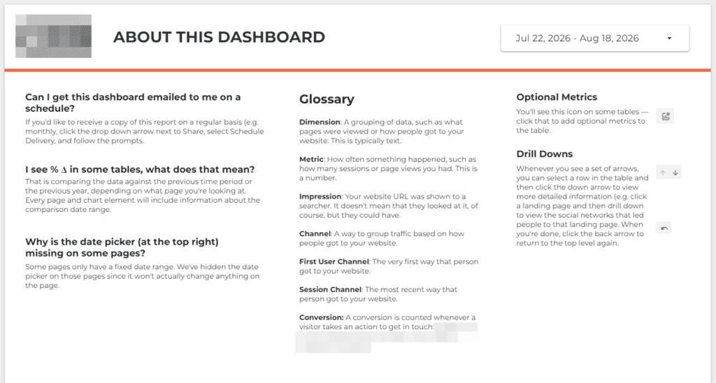
An example of the about page that I include in all my dashboards (not shown in video)
The specifications also include chart types and calculated fields, with the formulas if possible. It isn’t perfect (no AI tool will be) so sometimes it proposes ones I don’t need. In the walkthrough, it suggested a calculated field I could skip, because I knew could pull the day out of GA4 directly.
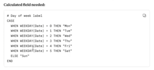
I don’t need a calculated field, this is in GA4 (3:14 in video)
If you’re handing this off to someone else to build who is less experienced than you, make sure to check it first to fix those kinds of mistakes.
Unfortunately, there isn’t an MCP for Data Studio so it won’t build this automatically. If you’re working with a reporting tool that does have an MCP, please do try to extend these instructions right into the build and let me know how that went!
I do find that dashboard builds with these specifications do go a lot faster because I’m not thinking “what’s the right chart here” or “how do I describe this” since that’s already covered. I’m basically following a to do list at this point instead of starting from nothing, which is so much faster.
How to share the dashboard
Once the dashboard exists, how should you share it with your client?
You might be tempted to schedule a regular dashboard presentation, maybe a nice slide deck. But I’d encourage you to try not to do that. Why? Those kinds of presentations are boring and I’ve never heard anyone say that they liked them.
The real benefit of Data Studio is that once the client has the link, they can pick whatever time frame they want, and look at the data whenever they want. We do still have an initial walkthrough with a client but that’s more of a “here is how Data Studio works” session, teaching them how to access drill downs, use filters, that sort of thing.
If you don’t present a report what do you do in that client meeting? I’d much rather spend that hour on what we’re going to do about the numbers than discuss the numbers themselves. Try it next time!
Common questions
I would say that the prompt matters less than the context. AIs understand what a reporting dashboard contains, so what you need to provide is the context that makes that dashboard unique to that client instead of something generic. Make sure to include information like the client’s business, important notes from your reporting conversations with them, and your own opinions about what belongs in a report and what doesn’t. If you’re just starting out, put your effort into the context first and then refine the prompt based on what you get back.
Absolutely and it means that your context is going to have some serious depth in a way that an agency will likely not have. You’ll know things that an agency rarely finds out: things like profit margins, how the CMO feels about specific regions or product lines, why your supervisor doesn’t trust this one specific number. If you’re in-house, I’d start with a running document of decisions and stakeholder questions as your input.
Where to start
Remember: none of it works because of the tool. It works because you had the context and gave it to the tool. Anyone can do the collecting part, and you don’t need a perfect prompt to start trying this process out.
Next time you’re about to build a new dashboard or add a page to an existing dashboard, write down the questions it’s meant to answer before you open Data Studio. Then check whether every chart you were planning maps to one of them. That’s what the prompt would do for you, but you’re doing it by hand first. That will tell you fairly quickly whether this is a solution worth automating or not.
If you’d like to see the whole thing running before you build your own, make sure to watch the walkthrough in the video above. And the built version of the skill comes with Analytics for Agencies if you’d rather not assemble one from scratch.

Dana enjoys solving problems that haven’t been solved before. With her 20+ years experience in digital marketing and teaching, she has a knack for distilling complex topics into engaging and easy to understand instruction. You’ll find Dana sharing her knowledge at digital marketing conferences around the world, teaching courses, and hosting a technology column.
Learn more about Dana